Built excellent software and still experiencing the bounce rate? Surely, you need to look for better UI/UX design tips that can enhance the user experience. Considering the latest design trends, we have concluded this blog with unique UI/UX tips for businesses. Read below to implement the best design strategies to enhance ROI.
Start your dream project?
We have a TEAM to get you there.Looking for the potential ways to improve your business presence, increase user engagement, and minimize the bounce rate of your website or app?
Here you need to check out the top 15 UI/UX design tips for business site in this video…
You may have a brilliant business app idea or have built an amazing website with full-fledged advanced functionality. But still many times, businesses fail to convert their visitors into potential customers…
The major reason behind is the poor UI/UX design…
While visitors browse through the options, they first notice the UI/UX design of the website. To hold a visitor on your website little longer, first you need to check out the UI/UX design of your site. The complicated navigation or too much stuff on page can quickly make them jump on the other site.
So let’s pay attention to the top 15 UI/UX design tips for businesses to create an effective UI/UX design that will attract more customers, reduce your bounce rate, and generally work in your favor from start to finish.
What Should You Know About UI/UX?
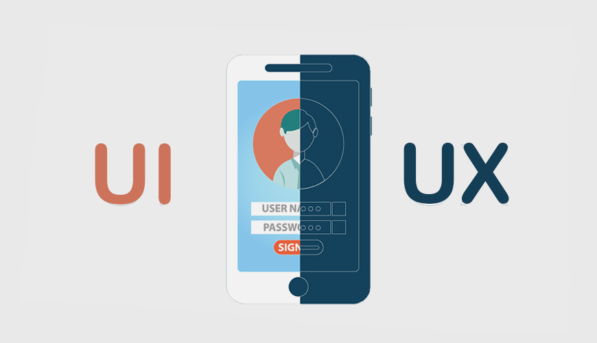
User interface design and user experience (UI/UX) are concepts you will encounter frequently while designing your website. If you’re still confused about what these terms mean, don’t worry—UI stands for user interface, and UX stands for user experience. User interface design refers to all of a website’s components that users interact with on-screen: buttons, links, forms, and checkboxes.
User experience design, on the other hand, includes more intangible factors such as how easily a visitor can find specific information on your site and whether or not it’s easy to complete certain tasks (like purchasing something). These concepts overlap in some ways: You’ll want great UI when creating good UX. Ultimately, though, they’re different areas of focus that require different skill sets.
Why UI/UX Design is Important?
Before we move on to how you implement such unique UI/UX design tips in your app can make your design, I believe it’s necessary to understand what User Interface (UI) and User Experience (UX) are. Some businesses consider hiring a mobile app developer to implement the best design for their app. In short, they are two different aspects of making design. It’s important to know what these two terms actually mean because many designers just assume that someone else is working on them.
15 UI/UX Design Tips for Your Website
1) The Colors You Choose Say More Than Words

Source: Tubik blog-Tubik studio
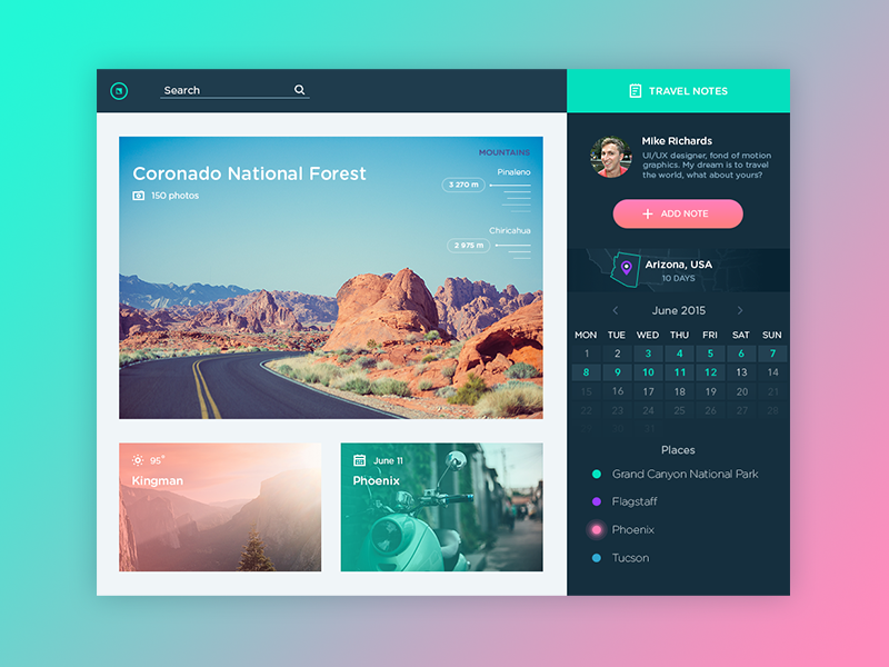
Colors are powerful tools, and they can have a huge impact on how your site is perceived. Using contrasting colors in your web design attracts attention, but it’s important to use only colors that complement each other.
Make sure you know what others think: Just because you like something doesn’t mean everyone else will as well. Take some time to show your work to others before moving forward with it. Whether it be friends, family members, coworkers, or even complete strangers.
So you can get feedback and make changes where necessary.
This can be a huge mistake! In fact, when we asked top startup CEOs which area of their business needed help most often, their response was User Experience Design every time. So to make it work, it is worth hiring a web developer who better understands it.
Why? Because it has been proven again and again that great UI/UX design tips will increase user engagement with your product or service at least 5x.
Hence, you should take both very seriously when designing your website.
2) The Importance of Typography
Typography is not just about choosing a typeface and sticking with it. Rather, for many developers, it can be one of the most important UI/UX design tips.
True typographic expertise involves choosing a typeface and then adjusting it to fit your message. So it makes sense to hire software developers in India who better understand it.
For example, if you’re in finance, you might use serif typefaces, which convey information in a more sophisticated way.
If you’re selling children’s toys, on the other hand, using a decorative font may be more appropriate. Understanding typography is essential to good design; remember that sometimes simplicity is more important than complexity when communicating your message effectively.
3) How Do People Perceive Your Logo
First impressions matter. If you are eyeing the important UI/UX design tips then consider your logo design.
A good logo will positively impact how people perceive your business and can help grow sales. So it makes sense to look forward to hiring a website designer to customize the logo design.
Research has found that just 10 seconds is all it takes to form an opinion of a new logo, so before you get to work on developing a brand identity, you need to figure out who your audience is and what they want.
Look at popular brands today and you’ll notice many are able to use their logos as verbs – something customers can’t help but interact with.
Keep that in mind when developing your own logo. People need to be able to see your brand’s personality in every aspect of their life. If you don’t include that, it could have devastating effects on sales down the road.
4) Using Pictures Where Words Fall Short
These could be the most amazing UI/UX design tips for businesses.
Words may be a business’s first form of communication, but sometimes your message is better communicated with pictures. Think about all those beautiful photos you see in travel brochures and advertisements: they effectively sell an experience.
To make it more impactful, hire iPhone app developers in India as they have excellent knowledge and expertise in implementing this trick.
Unfortunately, many businesses rely on words to tell their story, and in doing so often fail to capture their customers’ imaginations. For example, if you have a picture of your product, there’s no need to write a paragraph telling people what it looks like; they can just look at it.
Pictures are more memorable than words anyway—you don’t remember things that aren’t memorable—so why not use them? If nothing else, adding visuals makes your content more interesting and engaging to read.
5) How to Design Forms That Don’t Disengage Customers

Source: Ninja forms
Forms are a necessary evil in any business, but they can also be a major source of customer frustration. It’s important to remember that you’re asking customers to do something on your website.
Whether it’s to give up their information or money, engage with your brand, or even just leave comments on social media. That can feel like a lot of pressure. By keeping some simple best practices in mind when you design forms, you’ll make it easier on both yourself and your customers:
a) Keep Forms Short: People don’t want to spend a lot of time filling out forms—they just want whatever information you have and then they want to get back to browsing your site.
b) Emphasize Call-to-Action Buttons: Often, you’ll have multiple fields on a form—both required and optional. You can hire Android app developers in India to add CTAs strategically. It’s important to organize these fields in an intuitive way, but also make sure that your call-to-action button is visible and easy to click.
c) Use Placeholder Text and Error Messages: People making a mistake on a form is inevitable, but that doesn’t mean you should force them to start over. By adding placeholder text—or instructions—to your forms, you’ll make it easier on people and less likely they’ll leave your site before completing a transaction.
d) Use Required Labels: When it comes to forms, we generally use two labels: required and optional. This is a good rule of thumb because most people want to know what information they need, and they don’t want to waste time filling out fields that aren’t essential.
e) Use Bullets, Not Blocks of Text: If you need to communicate a lot of information on your form, it’s better to put it in bullet-point format. This can be one of the brilliant UI/UX design tips for businesses to adopt.
People don’t want to read blocks of text—not even on websites—and bulleted lists help with that. It also makes everything look neater and easier to scan. How do you know what information is most important? Use call-to-action buttons.
f) Make Sure Your Form Fits on One Screen: Sometimes, you have to make a form longer than one screen—but when possible, try to keep it short enough so people can fill out all their information without having to scroll down multiple times.
g) Make Sure Required Fields Are Visible at All Times: When someone starts filling out a form, they should be able to see all required fields right away.
6) Creating Buttons That Stand Out and Work Well

Source: CreateBytes
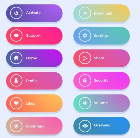
Your button should be big and attention-grabbing, but not so big that it’s distracting. It should be placed in a place where people can easily see it but also where it won’t get lost in your content.
For example, you may want to put your Buy Now button at the top of a product page to encourage users to make a purchase without having to read through much of your content.
And in general, it’s best if you keep buttons minimal—the more words or images on them, the harder they are to click.
7) Personalizing the Experience with Colors, Graphics, and Photos
People are drawn to images and respond well to graphics, logos, and colors. The right images can make a real difference in your appeal to your customers. You can hire a React Native App developer in India who is experienced in using RN widgets.
And remember, if you have photos or graphics (even if they’re clip art), they’ll stand out more than boring text links.
Personalizing your design with elements that speak to your target audience is one of the best ways to increase conversions on landing pages and elsewhere on your site.
For example, if you’re selling furniture for kids, having an All About Kids section with pictures is a great way to personalize their experience in a subtle but impactful way that gets them excited about their purchase and moves them towards conversion.
8) Keep Your Website UI/UX Design Simple

Source: Wix
You don’t want to burden users with too many elements on your site; it should be easy to navigate and use. Remember, you’re not just designing a site—you’re creating an experience that leaves users feeling positive about your business and ready to come back.
The simpler you keep things, the more likely people are to do what you want them to.
9) Fixing Common Mistakes That Make Websites Difficult to Use or Navigate
While it’s easy to create a website, a poorly designed website can lose you, customers. Bad UX design is one of five reasons your business may not be getting as many sales as you would like. In fact, a bad user experience has been proven to reduce conversions by at least 20 percent.
Fixing common mistakes that make websites difficult to use or navigate will help businesses increase their bottom line. This could be one of the most proven reasons to adopt the latest UI/UX design tips for app development.
Creating an effective user experience is critical in any design project, but when it comes to increasing conversion rates, simplicity wins out every time.
So get rid of any unnecessary clutter or buttons that don’t serve a purpose, and make sure nothing stands in between your visitors and what they came for: whatever it is you sell.
10) Staying Consistent in Tone Across Your Website
Writing on your website is one of your most powerful marketing tools. It’s an opportunity to establish credibility and personality, build trust with potential clients, and sell. And you can hire PHP developers to ensure that your website will remain in the pros’ hands.
To ensure you’re putting your best foot forward, we recommend creating a style guide—an easy-to-follow document that explains how copy should be written on every page of your site.
A style guide ensures everything from tone to formatting is consistent across all your pages. It also helps future writers quickly understand how content should be written so they can keep a similar voice to other articles on your site.
Read More: Top UI/UX Design Trends in 2024
11) Keeping the Site Clean
A website with too many elements may look cluttered and confuse users. When designing a site, start by determining which elements are needed to present your message and then eliminate any that aren’t serving a purpose. Here are some important questions to ask yourself when keeping your site clean:
1) Does each element on my page give value to visitors?
2) If it doesn’t add value, is it at least useful?
3) Is it helpful?
4) Is there anything here I don’t need?
5) What if I took [insert part of page] away or made it smaller or moved it?
In general, remove or simplify anything that takes away from usability or detracts from the content.
12) Less is More
For many business owners, time is one of their most valuable assets. It’s something that can never be replenished and has a finite amount every day.
In order to maximize your working time, it’s important to consider what can be removed from your routine—even if you think those items are essential.
You can choose to hire a Flutter developer when it comes to writing the least amount of code. It is based on a single codebase, though no need of writing the codes for different platforms.
For example, even if you enjoy editing photos and thinking up album names for all of your Facebook pictures, it probably isn’t worth an hour of your week (if not more) that could instead be spent on more important tasks such as strategy or sales meetings.
Be honest with yourself; sometimes less is really just more.
13) Using Familiar Language
Words that are easier to read, recognize and memorize will make your site more appealing to users. Also, try keeping your sentences short; it helps with readability.
Designing with words that have a higher frequency of use (i.e., common terms) will give your site a more conversational tone and is likely to be much better received by its audience.
Think airline rather than air transport service providers or browsers rather than Internet navigators. And if you want to make sure that users can understand you when they don’t necessarily speak English as their first language, use Google Translate!
14) Making Interactions Direct
There are two big rules that govern good UX design: make your interactions direct and eliminate bottlenecks. Making an interaction direct means that you let users get to where they want to go with a few clicks as possible.
Eliminating bottlenecks, on the other hand, is about organizing and breaking down tasks so that they’re simple to complete in a logical order.
When done right, your app will be easy enough to learn without instruction but efficient enough that users don’t need constant reminders of how to do things. The combination of these two principles should help you create more intuitive user experiences on your website or app.
15) Applying Logical Placements

Source: Adam Silver
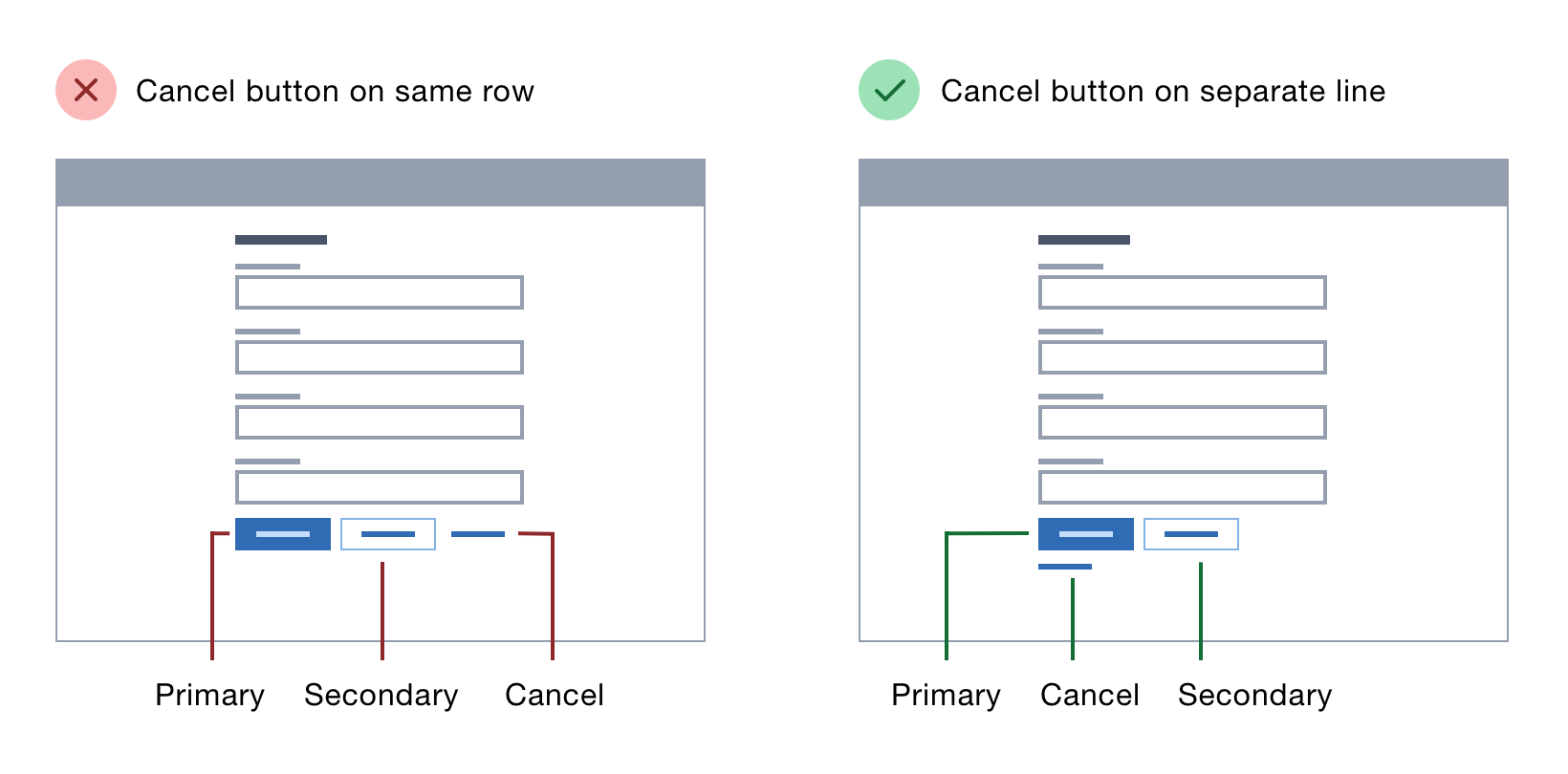
Just because a button looks good on a piece of paper doesn’t mean it will work well on your website. As you try to match button sizes, positions, and placements with real-world scenarios, you may discover that button placement isn’t quite what you expected.
If users can’t figure out how to use a call-to-action, move it or make it bigger. Remember: Designing software is different from crafting physical products — if your customer can’t interact with something by way of an interface, they won’t be able to use it.
Conclusion
Designing software to be intuitive and easy to use is critical for businesses, as it ultimately leads to a better experience for their customers. The key is thinking about who will be using your software, what they need from it, and keeping that in mind when you’re creating new features or revamping old ones.
Although usability testing is important, these 15 tips should help developers and designers think more strategically about how they build products with users in mind. More importantly, these ideas can help increase user satisfaction overall. You can hire an app developer that helps you implement these tips accurately.
Even if users don’t realize why something works well (or doesn’t), chances are they’ll continue using your product regularly if it was designed with them in mind.
If you are planning to update your product with the latest UI/UX designs, then AppsDevPro can be your professional technical partner for the project. You can drop a query or contact us for the project discussion or get a free price estimation!
FAQs
How To Create a Good User Experience (UX)?
Creating a great user experience (UX) begins with understanding your target audience. Think about what they need and how they interact with the product.
After determining who you’re designing for, focus on creating an intuitive and engaging design that is simple to navigate and attractive enough to access.
Keep in mind usability, accessibility, and device responsiveness when developing your UX design. By keeping these elements in mind, you’ll be able to create an enjoyable user experience that keeps people coming back for more.
What To Consider When Designing Your Website?
When it comes to designing your website, there are some important factors to consider. Your website should be easy to navigate, with a clear and intuitive user interface.
It should also be visually appealing and relevant to your brand. Ensure that all elements are consistent in their design, color, and typography.
Pay attention to the user journey and think about how they interact with each page and content. Finally, make sure your website is responsive and optimized for all devices.
What Are The Benefits of Good UI/UX Design?
No matter what brilliant products and services you are offering. The poorly designed interface of your app can put all your efforts down the drain.
So here are a few benefits of implementing right UI/UX design strategies in your site:
1. Improved user experience – Good UI/UX design makes it easier for users to navigate your website and understand your content. It also provides a more enjoyable experience overall, helping to create a positive impression of your business and products.
2. Increased engagement – Having a great user experience increases the likelihood of people engaging with your website and returning to it in the future. Improved UI/UX design can result in increased web traffic and conversions.
You can also check our other services:
Hire Mobile App Developers, Hire Xamarin App Developer, Hire iPhone App Developers, Hire Android App Developers, Hire Flutter App Developer, Hire React Native Developer, Hire Kotlin Developer, Hire Web Developer, Hire PHP Developer, Hire Laravel Developer, Hire Nodejs Developer, Hire Microsoft Developer, Hire ASP.NET Developer, Hire Angularjs Developer, Hire Reactjs Developer, Hire Vue.js Developer, Hire E-commerce Developer, Hire Magento Developer, Hire WordPress Developer, Hire MERN Stack Developers, Hire MEAN Stack Developers, Hire App Developers
